

Hey there! Today is the big day for the Floracotta Quilt Along!
Whether you’re a quilting pro or a newbie, this is the perfect chance to pick up new skills, make new online friends, and create something truly stunning together.
Each week, I’ll be dropping a new tutorial to show you how to create each block in the quilt.
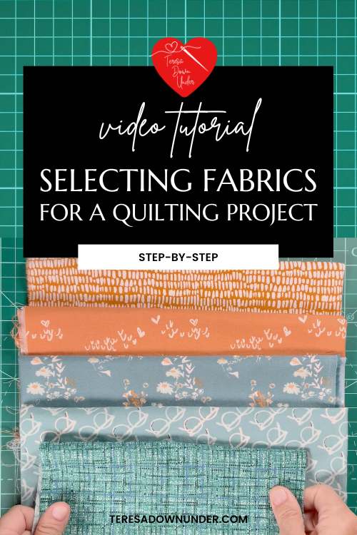
Today, we’re gonna get down and dirty with the super fun task of picking fabrics for your quilt. I know it can be overwhelming when you’re faced with a gazillion colors and fabrics. Hopefully some of my tried-and-true tips will help you navigate that fabric aisle like a boss and create a quilt that truly screams “you.”
First things first, think about the overall vibe or mood you want your quilt to have. Are you looking for something bold and vibrant, or do you want a peaceful and serene feel?
Take a sec to imagine the finished quilt and the kind of emotions you want it to evoke. That will be your guiding star as you make your fabric choices.
Next up, consider the color palette of your quilt. Do you want to stick with one color family for a monochromatic look, or do you wanna explore contrasting shades for a bit more pizzazz?
Play around with different color combos by placing fabric swatches side by side and see how they vibe together. And don’t be afraid to mix things up and experiment with unexpected colors. Sometimes the most eye-catching quilts come from totally wild pairings!
Watch today’s video to get some tips and inspiration and let’s get this quilting party started!
Practical tips on selecting fabrics
So, when it comes to picking fabrics that go well together, you’ve got a few handy methods to choose from.
Let’s dive into three easy-peasy ways to find fabrics that totally match each other!
To summarise:
- Using fabrics from a single collection:
Fabrics within the same collection often go well together, so you can choose fabrics from one collection to ensure they match. - Considering the fabric color palette:
Use the color palette of a fabric as a guide and select other fabrics that coordinate well with it.
For example, if you have a busy print fabric, you can choose other fabrics with solid colors, tones that match, or less busy prints. This creates a harmonious combination. - Selecting a background fabric:
In most of the quilts I make, I use a unifying background fabric.
My preferred background colors are white and cream. These colors provide “breathing space” in the quilt and make the design stand out.
Using applications to help with color selection
There’s this great tool called Adobe Color that I absolutely love. You can check it out on the video. It lets you create your own color scheme from scratch, or if you’re feeling lazy, you can even upload an image and it’ll generate a color scheme based on the colors in the image. It’s super fun to play around with and try out different color combos!
And if you’re still scratching your head trying to pick a fabric collection, check out some of my favourite designers: Heather Bailey, Bonnie and Camille, Valori Wells, and Jocelyn Proust. Their fabrics are always beautiful.
Join the QAL
Get the pattern
Floracotta quilt video tutorials

Join my Patreon page

Get a new video tutorial every week plus other exclusive perks with 3 membership tiers.
Stay connected
Subscribe to my blog, follow me on YouTube , Instagram or join my Facebook group and Facebook page.
My book and other publications
You can now purchase individual chapters from my book as bundles of 4 unique quilt patterns.
If you prefer to own the complete book, Turnabout Patchwork, please note it is currently out of print. However, you might still be fortunate enough to find a copy on Amazon.
Explore all the quilts from the book in real-life projects!